
By Lana Lounsbury
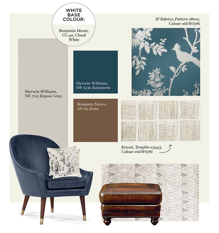
PALETTE 1 – CLASSIC, WITH A TWIST
With a bright and warm off-white like Benjamin Moore CC-40 Cloud White, you can paint your walls, trim and ceilings all the same colour. Just be sure to add sheen for the trim paint and remove sheen for the ceiling paint. For dramatic fun, try the bold Sherwin-Williams SW 6230 Rainstorm on trim, panelling and walls in a dining room or powder room.
Now introduce some blue (yes, blue is still a top colour for 2016), with modern hues of faded denim, peacock and navy in the spotlight. I love using bold blues in furniture or area rugs because they pair well with soft greys, like Sherwin-Williams SW 7015 Repose Gray, and with brown leather and wood furniture, like Benjamin Moore’s AF-165 Kona.
Chair: made.com / Pillows: safavieh.com / Ottoman: Bassett Furniture / Rug: dashandalbert.annieselke.com
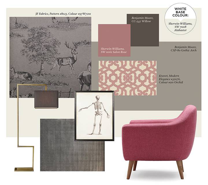
PALETTE 2 – IRREVERENT
I love deep charcoal-brown colours like Benjamin Moore’s CC-542 Willow on interior and exterior doors. Unlike black, which is very linty for upholstery, this colour also looks and wears well on the sofa or dining chairs. Keep your home cozy but up to date by pairing it with moody, mushroom-grey floors or wallpaper in the tone of Benjamin Moore CSP-80 Gothic Arch and sunny white walls like Sherwin-Williams SW 7008 Alabaster in a washable flat sheen.
Gloss sheen paints hold up more durably against marks and will not show wear as easily as flat paints, but they do show imperfections in the surface they cover, so they’re not good for walls or worn millwork. One trick we use in heritage homes with original mouldings is to paint the ceiling, crown and picture rail in a flat paint to give the effect of European plaster mouldings and to hide new filling and sanding.
Irreverence comes into play in this scheme when you add your favourite fantasy colour. For anyone who wants to be on the cutting edge, that often means purple or pink. Both hues are hot, hot, hot, but they are tricky to pull off because they don’t make good wall colours. For something that says, “Just when you thought you knew me,” I recommend Sherwin-Williams SW 0061 Salon Rose in a tweed or mohair on a big, modern chair in the corner of your living room. Unlike the way “a pop of colour” has been done in the past — where an accent colour is repeated throughout a home or space — being irreverent means only using your fantasy colour once. That’s the way to stand out.
Lamp: Restoration Hardware / Rug: kravat.com / Skeleton print: Timothy Oulton / Chair: meandmytrend.com
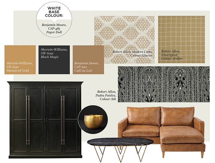
PALETTE 3 – NEW NEUTRALS
White loves a foil, and black is perfect for this, but it needs to be obsidian, not charcoal. For this, we love Sherwin Williams’ SW 6991 Black Magic, in satin for cabinets and gloss for interior doors. White marble will always be classic, but black marble with white veining looks new again for side tables and fireplace mantels.
With gold leading the way in metal finishings this year, it’s no wonder we’re seeing it come on strong in fabrics as well. Our favourite velvet hue, Sherwin-Williams SW 6130 Mannered Gold, pairs well with the greys you already own as well as the golden browns like Benjamin Moore CSP-290 Café Au Lait. These golden browns look great in natural finishes such as woven-grass shades, wood furniture and leather upholstery.
An orange like CSP-290 Café au Lait keeps leather looking modern and wood tones looking good in everything from light elms to painted black with undertones of grey or stony brown, rather than reds.
A crisp white like Benjamin Moore CSP-485 Paper Doll works on walls, trim and vertical accents like drapery. When pairing with warm colours like the golds and browns, we like to take all the yellow out of our whites so that they’re chalky to the point of a grey undertone for contrast.
And when layering a single colour with a monochromatic wall and drapery colour to create a canvas or a backdrop (or just to be obsessive!), it’s really nice to add small discordant touches: a wood-beaded tassel on the bottom of a chair or stool, a leather lip cord at the top of a drape, metal studs in the corners of a pillow.
Cabinet: Restoration Hardware / Leather sofa: johnlewis.com / Table: worlds-away.com / Gold bowl: Restoration Hardware

WHY GO WHITE?
White has been a longstanding design favourite for kitchen and bathroom cabinetry, and more recently in flooring and lighting, but it seldom takes centre stage. But this year there’s no denying it — white is the interior colour of the year. And yes, that’s unprecedented in the world of colour forecasting. Benjamin Moore has taken the brave step and declared Simply White is simply delicious. Glidden has made off-white its colour of the year for 2016, and Sherwin-Williams and Behr are wild about white too.
For those of you who have been timid at the thought of going white, you can see that white walls do not dictate a stark overall palette. This year’s whites set the stage for interiors that are bold, dramatic and full of colour.
With white on your walls, the focus shifts to your furniture, art and window coverings. It’s a refreshing change to have your wall colour showcase the pieces in your home that you collect, relax on and love.